Mirinda, PepsiCo’s popular fruit-flavored soda, is getting a makeover with new packaging for its cans and bottles.
This popular drink is available everywhere—in local stores, supermarkets, and restaurants. The latest redesign keeps the familiar look customers love—previously known for its logo combined with vibrant colors and images of fruit—but updates it with a bold, retro-modern feel.
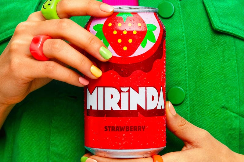
You’ll easily recognize the redesigned drinks thanks to their vibrant, ’80s arcade-style lettering and bright color combinations. Each flavor is highlighted by a simple, semi-circular fruit illustration, completing the fresh new look.
Mirinda® is celebrating its new look with a global campaign focused on positivity and enjoying life’s simple pleasures. Called “Smile Please,” the campaign encourages people to take a break and savor a refreshing Mirinda. To kick things off, they’ve launched “Smile Chain,” a fun online activity designed to spread good vibes.
PepsiCo’s Eugene Willemsen, CEO of International Beverages, announced that Mirinda is launching a new global campaign centered around embracing individuality and finding joy in everyday moments. He explained that in today’s fast-paced world, a little bit of happiness can make a big difference, and Mirinda’s updated branding and ‘Smile Please’ platform are designed to encourage people to take a break, recharge, and choose positivity.
Explore the latest Mirinda® rebrand in the gallery above.
To find out more about the new rebrand, head to the PepsiCo Design + Innovation website now.
Read More
- Last Furry: Survival redeem codes and how to use them (April 2026)
- Honor of Kings April 2026 Free Skins Event: How to Get Legend and Rare Skins for Free
- Gold Rate Forecast
- Clash of Clans: All the Ranked Mode changes coming this April 2026 explained
- Gear Defenders redeem codes and how to use them (April 2026)
- COD Mobile Season 4 2026 – Eternal Prison brings Rebirth Island, Mythic DP27, and Godzilla x Kong collaboration
- Honor of Kings x Attack on Titan Collab Skins: All Skins, Price, and Availability
- Brawl Stars x My Hero Academia Skins: All Cosmetics And How to Unlock Them
- Laura Henshaw issues blunt clap back after she is slammed for breastfeeding newborn son on camera
- FC Mobile 26 TOTS (Team of the Season) event Guide and Tips
2026-04-29 17:55