adidas and J-Pop Star Ado Team up for a Special 2026 Japan National Football Jersey
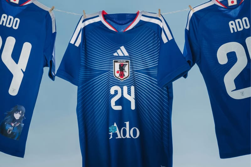
Adidas is blending music and sports with a new collaboration featuring Japanese singer Ado and the Japan National Football Team’s 2026 Home Jersey. The jersey builds on the team’s “HORIZON” concept, inspired by Japan’s coastline, and updates the iconic “Samurai Blue” look with a clean, modern design featuring a striking graphic across the front.